Guest viewing limit reached
- You have reached the maximum number of guest views allowed
- Please register below to remove this limitation
You are using an out of date browser. It may not display this or other websites correctly.
You should upgrade or use an alternative browser.
You should upgrade or use an alternative browser.
Yay or Nay
- Thread starter nattydisaster
- Start date
menphisdaemon
New member
It looks good Natty! R u goin' to change the brand?
nattydisaster
PESCIENCE.com
It looks good Natty! R u goin' to change the brand?
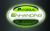
Why have officially changed to Physique Enhancing Science. Just made more sense for our direction to me, since we have products planned not just for performance but also for physique changes.
And we like to be considered an overall company dedicated to physique enhancement and education, not JUST supplements
Glad you guys like it! We will move forward with it
nattydisaster
PESCIENCE.com
Will be for everything. Shirts, labels, website, etc
But never my avatar....I gotta stay retro
But never my avatar....I gotta stay retro
kevinhy
Well-known member
Good, because I was about to make it my avi.Will be for everything. Shirts, labels, website, etcBut never my avatar....I gotta stay retro
nattydisaster
PESCIENCE.com
The green is just an example. We aren't changing the colors of everything just the design
I was more asking about the layout of physique enhancing science vs just PES
I was more asking about the layout of physique enhancing science vs just PES
thebigt
Legend
Invalid Link Removed
how about Blue ?
never thought i would say this, but i want to see pes gone, lol.
TheMeatus101
Well-known member
yay
bdcc
Legend
Very Green Lanternish...I like!
Did Kevin help with that design?")
Thank you. I drew it freehand with some crayons.
schizm
Well-known member
Thank you. I drew it freehand with some crayons.
Good job Ben! And good thinking NOT using an Etch-a-Sketch...b/c I know how giddy with excitement you can get and do a lot of jumping around...
")
nattydisaster
PESCIENCE.com
Ben was really good at coloring inside the lines when he was a kid
dagecko
Registered User
I agree with the "Science" part being the same shade of green as the "Physique" part. I like the design! Thumbs up!I think it looks good aside from the color..i like red. But, if it makes any difference id make the light shine on the science part aswell, as it looks a lot duller.