Hurleyboy05
Well-known member
- Awards
- 1
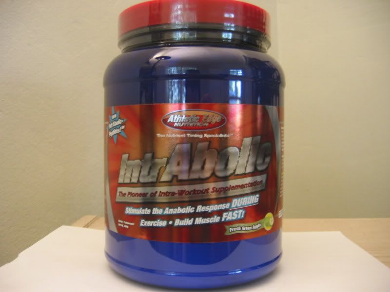
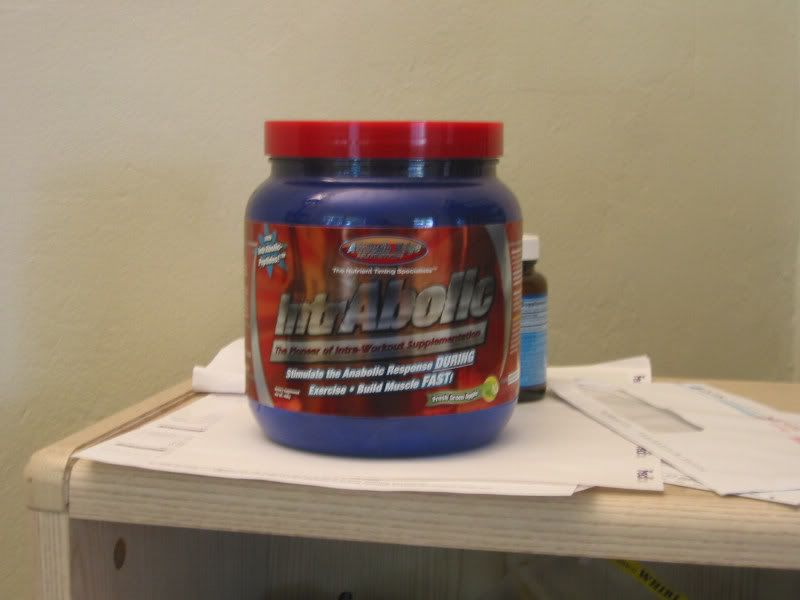
You guys have, by far, the best looking labels for your supps. I don't know if you guys did some marketing research before hand (surely) to pick just the right colors, but something about your labels inspires confidence, in me at least.
So I guess I'm just saying, good job! On marketing, and creating impressive supplements.
:cheers:
So I guess I'm just saying, good job! On marketing, and creating impressive supplements.
:cheers:
")